Taking the American Pulse
Taking the American Pulse

What is the Household Pulse?
Realtime Survey Data
Since March 2020, the Census has surveyed tens of thousands of households every two weeks. The real-time information relates to everyday topics like food, housing, spending, and childcare.
Insights and Data Grouping
We've sliced and diced the survey results to give meaningful insights on a number of themes. Different communities have felt the impact of the pandemic in different ways, so you can group data by race, education, income, and city.
A look back, a look forward
This website offers a powerful tool to look back at how COVID-19 has changed household life over time. Data collection is ongoing, and new questions are added each month. Through 2022 and beyond, the Household Pulse survey offers new unprecedented insights.
Why is this important?
Real information, now
Understanding how people spend child tax credits, opinions on the vaccine, and real-world financial outcomes of COVID-19 have been hot topics of debate. This data allows us to find critical insights on the current state of US households.
Different experiences of COVID
By grouping or “cross-tabulating” data by income, education, city, or race, we're able to understand how different communities have been impacted, often unequally.
A resource for high-impact questions
The household pulse survey data opens the door to think about different impacts of the pandemic. The preliminary insights that the survey provides us and the opportunity to ask more questions. The data can help shape policy, community, and life with COVID (and beyond).
What can I do with this website?
Explore Themes
Think about this site as a diagnostic tool, a way to take the pulse of things happening in US households. Survey answers often raise more questions than they answer!
Group data
Different communities have been impacted inequitably in the pandemic. To understand difference impacts, you can group data by education, income, race, and metropolitan area.
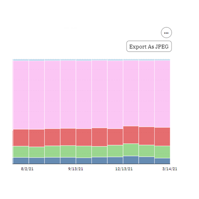
Access data, export insights
Each chart can be exported as an image. You can also export the data as an Excel or Google Sheets compatible CSV file.
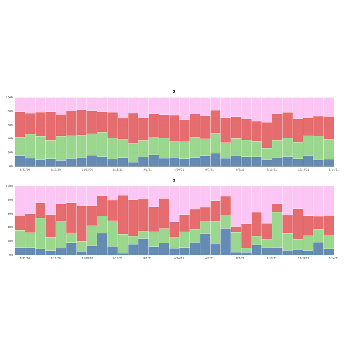
Interpreting Household Pulse data
The household pulse survey started collecting data in Spring 2020, and it publishes data in two week survey response periods.
The chart below shows the range of responses over time as a share of total responses. A bigger bar represents a larger share of responses.
You can hover over each bar to get a breakdown of responses.
Grouping data by education, income, age, race, and more
All questions on this site can be explored across racial, education, income, and other data groupings or cross-tabulations. This means you can see how different groups were impacted differently, and often disproportionately.
Below, the same question shows different responses from people with different educational attainment.
Understanding motivations, opinions, and decision-making
Some questions ask about the reasons or motivations behind choices in response to the pandemic. For these questions, each response is presented as a change over time between two data snapshots. The dot represents the first data entry (in the example below, the survey taken on 2021-04-26) and the arrow represents the more recent data snapshot (below, 2022-04-01).
If fewer people reported that answer, then the arrow will be red and facing left. If more people responsed with that answer, it will be green and facing right.
These questions allow survey takers to respond to all possible answers, so the total percent may be greater than 100%.